

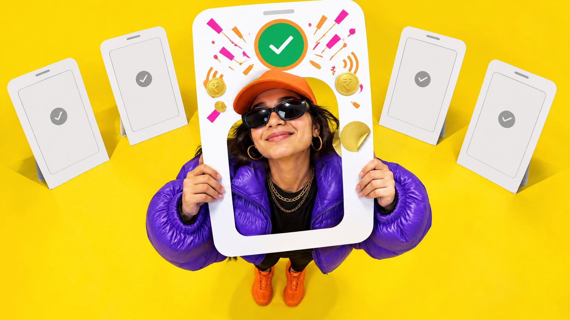
Stand at a chai stall in Gurugram and watch ten people pay. Ten phones, ten scans of the same QR sticker, ten PIN screens that look identical because NPCI designed them, ten green ticks. If you took the status bar off the screenshots you could not tell PhonePe from Google Pay from Paytm from CRED for most of the journey. That is the UPI branding problem in one queue: the rails are shared, the merchant is shared, the flow is standardised, and the brand has perhaps four seconds of the transaction to itself.
- Why do all UPI apps look the same during a payment?
- Where can a UPI app’s brand actually live?
- What are NPCI’s norms for using the UPI logo and marks?
- How do the major UPI apps differentiate, and who does each touchpoint best?
- What does each app’s strategy tell a new entrant?
- What should a UPI app’s brand system include beyond the logo?
- People also ask
Why do all UPI apps look the same during a payment?
Because most of the payment is not theirs to design. Three layers of standardisation flatten the experience.
- NPCI’s flow and screens. The UPI PIN entry screen is rendered through NPCI’s common library inside every app. It looks the same in PhonePe, Google Pay, Paytm and BHIM because it is the same component. The payee’s name is displayed as the bank holds it, the amount field behaves the same way, and the transaction reference number follows one format. A third-party app provider can style the screens before and after, but not the moment the customer enters the PIN.
- The shared merchant. The QR sticker on the counter is a standard UPI QR that any app can scan. The merchant’s name, the amount and the confirmation are the same whichever app pays. The merchant may have a PhonePe or Paytm soundbox and a branded standee, but the customer’s app is not part of that surface.
- Product parity. UPI Lite, UPI AutoPay, credit on UPI through RuPay cards, UPI Circle for delegated payments, international acceptance: NPCI launches a feature and every app ships it within months. Feature-led differentiation lasts a quarter.
The result is that UPI apps are among the least differentiated products in Indian fintech at the exact moment of use, and among the most differentiated in market share. PhonePe and Google Pay together handle the large majority of UPI volume; NPCI’s proposed cap on any single app’s share of volume has been extended more than once, which says something about how hard it is for the rest to convert brand into habit.
Where can a UPI app’s brand actually live?
Everything outside the NPCI-controlled core. These are the surfaces, in the order a customer meets them.
- Acquisition and onboarding. The app store listing, the first-run screens, the bank-linking step and the permission requests. This is the longest unbroken stretch of brand a UPI app gets, and most apps waste it on generic illustration. CRED’s onboarding sells membership before it sells payments; Jupiter’s sells the account. Both set an expectation the payment flow then confirms.
- The home screen. The grid of services is the app’s face. PhonePe’s dense, purple, everything-store; Google Pay’s people-first list; Paytm’s blue mall of tiles; CRED’s black, sparse, single-column feed. This is where the brand’s personality is most visible, and where most users spend the most time.
- The scan and pay entry. The camera view and the amount screen are the app’s last owned screens before NPCI’s PIN component. A distinctive scanner frame, a typeface for the amount and a colour for the pay button are small but repeated thousands of times.
- The success moment. After the PIN, the app owns the result screen. This is the emotional peak of the transaction and the single most valuable branded moment: the tick animation, the sound, the haptic pulse, the reward reveal. Google Pay’s scratch card, PhonePe’s chime, CRED’s quiet confirmation and coin count, Paytm’s voice line are all attempts to own this half-second.
- Sound and haptics. On the customer’s phone, the success sound and vibration; at the merchant, the soundbox voice. Paytm made the soundbox a category, PhonePe and Google Pay followed with their own devices, and “Paytm par X rupaye prapt hue” became a brand asset heard in every market. A sonic identity for a UPI app is not optional; silence is a choice the customer will notice.
- Rewards. Cashback, coins, scratch cards, jewels. The mechanic is a brand decision: random reward (Google Pay), earned currency (CRED coins, Jupiter jewels), flat cashback (Navi, super.money), tiered membership (CRED). Each signals who the app is for.
- Notifications and statements. The payment confirmation push, the monthly spend summary, the transaction history layout. These carry the brand into the customer’s day when the app is closed. A statement typographic system and a notification voice are brand assets most UPI apps never design.
- Customer support. The dispute and refund journey. UPI failures happen; the brand that handles them clearly (status visible, timelines stated, human reachable) earns the trust that decides which app becomes the default.
- Offline collateral at the merchant. QR standees, stickers, soundbox skins, shop-front boards. This is the most visible UPI branding in the country and it is decided by the merchant-acquiring side, not the consumer app team. PhonePe and Paytm’s dominance at the counter comes from years of this.
SIGNALNewsletter by Yamm Labs
The next piece, straight to your inbox.
New writing on BFSI brands, B2B and influencer marketing, and AI search.
One click to unsubscribe. Privacy policy

What are NPCI’s norms for using the UPI logo and marks?
NPCI owns the UPI, BHIM and RuPay marks and publishes brand guidelines for their use by banks, third-party app providers and merchants. Described generally, because the guidelines are updated and the version in force should be checked before any release:
- The UPI mark must appear. An app offering UPI is expected to show the UPI logo on the relevant screens and in its communication about UPI payments, in the approved artwork, colour and clear space. Recolouring the UPI mark to match the app’s palette is not permitted.
- “Powered by” and lockups. NPCI specifies how the UPI mark sits alongside the app’s own brand and the PSP bank’s name, including minimum sizes and which version (full colour, monochrome) to use on which background. The app’s brand can be dominant; the UPI mark cannot be distorted or hidden.
- Merchant surfaces. QR standees and stickers carry the UPI mark and, commonly, the BHIM mark, alongside the acquiring app’s brand. Merchant collateral that omits the UPI mark or makes it illegible falls outside the norms.
- No implied endorsement. An app may not present the UPI or NPCI marks in a way that suggests NPCI endorses the app over others, or that UPI is the app’s proprietary product.
- Feature marks. UPI Lite, UPI AutoPay and credit on UPI have their own naming and mark conventions; an app’s feature naming should not rename them into something proprietary that hides the standard.
The design consequence is that the UPI mark is a fixed element on several key screens, and the app’s identity has to be built to sit next to it without clashing. Test the app’s primary colour against the UPI mark’s colours before locking the palette; we discuss the wider palette question in colour psychology for financial brands.
How do the major UPI apps differentiate, and who does each touchpoint best?
The table below is our reading of the current field. It is an assessment of design choices, not of market share, and it describes each app’s approach generally.
| Touchpoint | Who does it well | What they do |
|---|---|---|
| Onboarding and first run | CRED, Jupiter | Sell a membership or an account, not a scanner; the payment flow arrives as a benefit of belonging. |
| Home screen personality | PhonePe, CRED | PhonePe’s purple density is an everything-store; CRED’s black restraint is a club. Both are unmistakable at a glance. |
| Scan-and-pay entry | Google Pay, PhonePe | Fast camera, clear amount typography, a pay button in the brand colour. The speed is the brand. |
| Success moment (animation, sound, haptic) | Google Pay, CRED, PhonePe | Scratch-card reveal; a quiet confirmation with a coin count; a distinctive chime. Each owns the half-second after the PIN. |
| Merchant sound | Paytm, PhonePe | Soundbox voice lines heard across markets; the device itself is a branded object on the counter. |
| Rewards mechanic as brand signal | Google Pay, CRED, super.money, Navi | Random delight; earned currency for the affluent; flat cashback for the value-seeker. The mechanic tells you the audience. |
| Notifications and statements | Jupiter, CRED | Spend summaries and categorised histories designed as a product, not a log. |
| Offline merchant collateral | PhonePe, Paytm | QR standees, stickers and soundbox skins at scale, in a colour owned in the category. |
| Trust and public-good positioning | BHIM | NPCI’s own app, government-adjacent, tricolour cues; the reference point for what “official” UPI looks like. |
| Ecosystem integration | Amazon Pay, Paytm | UPI inside a commerce app; the brand is the store, and paying is a feature of shopping. |
| Restraint under regulatory stress | Paytm (2024 handle migration) | Moving UPI handles to new PSP banks without changing the customer-facing brand; a test of how much identity sits above the rails. |
What does each app’s strategy tell a new entrant?
- PhonePe owns a colour and the counter. Purple in a category of blues, plus merchant acquisition at a scale that makes the brand the default at the shop. A new entrant cannot copy the second part; it can learn from the first.
- Google Pay owns a mechanic and a friend list. Scratch cards made the success moment the brand, and the people-first home screen made paying feel like messaging. Its name is borrowed from a parent; its personality is its own.
- Paytm owns a sound. The soundbox voice is the most recognised audio brand in Indian payments. The 2024 migration of UPI handles away from Paytm Payments Bank showed that the brand sat above the rails; customers kept paying with Paytm while the PSP changed underneath.
- CRED owns an audience. Black, sparse, premium, membership-gated. UPI on CRED is a feature of a club, and the success screen is designed for someone who does not need a scratch card to feel rewarded.
- Navi and super.money own a number. Flat, visible cashback as the reason to switch, with a clean, direct interface. It is a brand built on a rate, which works until the rate changes.
- BHIM owns legitimacy. NPCI’s own app, refreshed more than once, is the public-sector reference: not the most inventive, but the one that defines what compliant looks like.
- Amazon Pay owns the shelf. Paying is a step in buying; the brand is Amazon’s, and the UPI function inherits it without needing its own personality.
- Jupiter owns the account. UPI is a rail inside a neobank whose brand is the relationship with money, not the payment. We wrote about that model in neobank branding: app versus Instagram.
The pattern: each leader owns two or three touchpoints completely. None of them tries to own all eleven. For a new UPI app the brief writes itself: pick the two moments you can own better than PhonePe and Google Pay, and make everything else clean, fast and compliant. Several of these apps sit in our ranking of India’s 50 best fintech brands by design, and the ranking rewards exactly this discipline.
What should a UPI app’s brand system include beyond the logo?
- A success-moment specification. Animation timing, sound file, haptic pattern, reward reveal logic, and the exact layout of the confirmation screen with the UPI reference and the NPCI marks in place.
- A sonic identity. One chime for success on the phone, one voice line and tone for the soundbox, one notification sound. Recorded, trademark-searched as a sound mark where possible, and documented.
- A motion language. Scanner frame, amount entry, loading state and tick animation designed as one family.
- A notification and statement voice. Copy rules and typography for pushes, spend summaries and transaction histories.
- A merchant collateral kit. QR standee, sticker, soundbox skin and shop-board templates with the UPI and BHIM marks in their approved positions.
- A compliance overlay. Where the UPI mark, the PSP bank name and the NPCI-required text appear on each screen, so that product teams cannot ship a screen without them.
In UPI, the rails are everyone’s; the half-second after the PIN is yours. Design it like it is the logo.
People also ask
Why do all UPI apps have the same PIN screen?
Because the UPI PIN entry is rendered through NPCI’s common library, a standard component that every app integrates. It ensures the PIN is captured securely and consistently across the ecosystem, and it cannot be restyled by the app. Branding has to happen on the screens before and after it.
Can a UPI app change the colour of the UPI logo to match its brand?
No. NPCI’s brand guidelines require the UPI mark to be used in its approved artwork, colours and clear space, with monochrome versions for specific backgrounds. An app’s own identity should be built to sit alongside the standard mark rather than absorb it.
What is the most important branded moment in a UPI transaction?
The success screen immediately after the PIN. It is the emotional peak of the payment and the first screen the app fully controls after NPCI’s component. Animation, sound, haptics and the reward reveal on that screen do more for recall than the logo on the app icon.
How do soundboxes affect UPI app branding?
Soundboxes turn a payment into an audible brand moment at the merchant’s counter, heard by everyone in the shop. Paytm established the category and PhonePe and Google Pay followed with their own devices. The voice, tone and phrasing of the confirmation line is a brand asset that should be designed and documented like a logo.
If your UPI app disappears when the status bar is cropped, the brand is not in the app yet.
Get a free Fintech Brand Audit across 8 dimensions, plus 3 fixes. No pitch. Run the free Brand Audit →
One Comment