


A pitch deck decides enterprise fintech deals faster than most founders realise. Before you have explained the product, the person across the table has judged the brand. A template deck signals a small vendor, and a small vendor does not get the purchase order from a bank. The same is true for an investor deck: polish reads as competence. Across 320+ BFSI projects since 2017, we have seen strong products lose to weaker ones because the weaker one showed up looking like it could be trusted with the account.
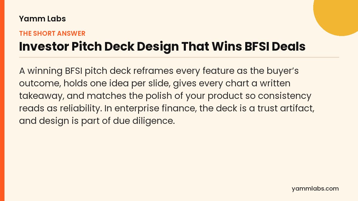
- Why the deal dies on slide 3
- Four mistakes that lose enterprise BFSI decks
- Feature to outcome: the reframe that wins
- A pre-send deck checklist
- Investor pitch deck or enterprise sales deck: what changes
- A slide-by-slide structure for an enterprise BFSI pitch deck
- Design the pitch deck for the review that happens after the meeting
- How to present numbers in a BFSI pitch deck
- A worked example: rewriting one slide
- How to brief a designer or agency on a pitch deck
- People also ask
Why the deal dies on slide 3
A CFO or a procurement lead decides fast. They are not reading your deck the way you wrote it; they are scanning for reasons to trust you or to move on. If the first few slides are a wall of features, an off-brand template and charts with no point, the decision is already tilting before you reach your strongest slide. The deck’s job in the opening thirty seconds is to earn the next five minutes.
Four mistakes that lose enterprise BFSI decks
Mistake 1: Feature dumping
You lead with your API, your architecture, your feature list. The buyer cares about their risk, their cost, their timeline. Every feature has to be reframed as their outcome. “Real-time reconciliation” is a feature. “Your finance team closes the month two days faster” is why they buy. Do the translation for them; do not make the CFO reverse-engineer the benefit.
Mistake 2: No visual hierarchy
Ten points at equal weight means zero points land. When everything on a slide shouts, nothing is heard. Enforce one idea per slide. The eye should know where to go the moment the slide appears, and it should land on the thing you most want remembered.
Mistake 3: Data with no story
A chart without a takeaway makes the buyer do the work, and a busy buyer will not. Every data slide needs a one-line headline that says what the number means. Do not show a growth chart; tell them the growth is accelerating and let the chart prove it.
Mistake 4: Off-brand and inconsistent
A deck that does not match the polish of your product breaks trust quietly. If your app is sharp and your deck looks improvised, the buyer notices the gap even if they cannot name it. Consistency signals reliability, and in BFSI, reliability is what is actually being bought. This is why a deck should descend from the same brand design system as the rest of the brand.
Feature to outcome: the reframe that wins
| What you wrote (feature) | What they buy (outcome) |
|---|---|
| Bank-grade encryption and audit logs | Passes your security review without escalation |
| Real-time reconciliation engine | Your team closes the month two days faster |
| Configurable rules engine | Compliance changes ship without a developer |
| 99.99% uptime SLA | No outage explanation to your regulator |
The pattern is simple. Name the feature to yourself, then write the sentence the buyer would say to their own boss. That sentence goes on the slide.
A pre-send deck checklist
- Is every feature reframed as a buyer outcome?
- Does each slide carry exactly one idea?
- Does every chart have a one-line takeaway?
- Does the deck match the polish and brand of the product?
- Would the first three slides earn you the next five minutes?
- Could a stranger skim it on mute and still get the argument?
A deck is a trust artifact. In enterprise finance, the first thirty seconds are the audition.
Investor pitch deck or enterprise sales deck: what changes
The same design principles apply to both decks, but the reader is asking a different question, so the argument changes.
An investor is deciding whether the company can become much bigger than it is today. The deck has to show the size of the problem, why this team can solve it, the evidence that it is working and what the money will do. Design helps by making the story easy to follow and the numbers easy to check.
An enterprise buyer at a bank, insurer or NBFC is deciding whether choosing you is safe. The deck has to show the outcome for their business, how the product fits their systems, how it handles their security and compliance obligations, and what the rollout will cost them in time and people. Design helps by making the vendor look as reliable as the product claims to be.
Most fintechs need both decks. Build them from the same template and brand system, then change the argument, not the look. A buyer who later sees your investor deck, or an investor who sees your sales deck, should recognise the same company. Keep a shared library of approved slides, such as the team, the product diagram and the security summary, so both decks stay current when one of them changes.
A slide-by-slide structure for an enterprise BFSI pitch deck
This is the order we use as a starting point for enterprise decks sold into banks, insurers and asset managers. Cut or merge slides to fit the meeting; keep the order.
- The promise. A title slide that states the outcome for the buyer, not the product name alone.
- Their problem, in their words. The cost, risk or delay the buyer lives with today, described the way their team would describe it.
- The outcome. What changes for them if they choose you. This is the slide that has to earn the next five minutes.
- How it works. One simple diagram. The architecture detail goes in the appendix.
- Proof. Results, pilots or references you can substantiate and have permission to show. Nothing you could not defend in a follow-up call.
- Security and compliance. Plain answers to the questions their risk and information security teams will ask.
- Integration and rollout. What the buyer’s team has to do, in what order, and who supports them.
- Commercial model. How pricing works, stated clearly enough to take to procurement.
- Team and support. Who they will actually work with after signing.
- The next step. One specific ask, such as a technical session or a pilot scope.
Design the pitch deck for the review that happens after the meeting
In enterprise finance, the deck you present is rarely the last time it is read. It is forwarded to information security, risk, procurement and sometimes legal, often without you in the room. Design for that second reading.
- Make every slide stand alone. A headline that states the point means a reader who skips your voice-over still gets the argument.
- Put the detail in an appendix. Architecture, data flows and certifications belong in clearly titled appendix slides that reviewers can find quickly.
- Claim only what you hold. List certifications, audits and regulatory permissions you actually have, in their exact names. An overstated claim found in review ends the deal faster than a missing one.
- Keep it readable when printed or viewed on a laptop. Sufficient contrast, legible type sizes and a clear title on every slide help every reviewer, including those using assistive technology.
If your deck makes claims about regulatory status or compliance, confirm the current wording with your compliance team before it is sent.
How to present numbers in a BFSI pitch deck
Finance buyers and investors read numbers for a living, so they notice careless ones quickly. A few habits keep data slides credible.
- Headline the takeaway. The slide title says what the number means; the chart proves it.
- Label units and periods. Every figure needs its unit, its period and, where relevant, its base. “Growth” without a period invites the first awkward question.
- Keep scales honest. Start axes where a reader expects them and use the same scale when two charts are compared side by side.
- Use colour roles consistently. If green means positive in your product, it means positive in the deck, and never decorates a neutral bar.
- Source every number. A small source line under the chart answers the question before a reviewer asks it.
- Show only what you can defend. If a number would not survive a follow-up call with the buyer’s finance team, leave it out.
Board and investor presentations follow the same rules at greater length; our guide to presentation design for BFSI board and investor decks covers them in more detail.
A worked example: rewriting one slide
The example below is illustrative, built from the principles in this guide, not taken from a client deck.
Before. A slide titled “Our platform” lists six features in equal-weight bullets: real-time reconciliation, configurable rules engine, bank-grade encryption, audit logs, open APIs and a dashboard. A screenshot fills the right half. The buyer has to work out which of these matters to them.
After. The headline reads “Your finance team closes the month two days faster”, the outcome from the reframe table above. Below it, one simple before-and-after diagram of the month-end process. A single line underneath names the feature that makes it possible, real-time reconciliation, and a proof line states a result the company can substantiate. The other five features move to other slides, each reframed as its own outcome, or to the appendix.
The rewrite removes nothing true. It changes the order in which the buyer meets the information, so the reason to buy arrives first and the feature arrives as the explanation.
How to brief a designer or agency on a pitch deck
- The audience and the decision. Who will read it, and what you want them to decide after reading.
- The argument in five sentences. If you cannot write it, the designer cannot design it.
- Your brand system. Templates, colours, type and product screenshots, so the deck matches the product.
- The proof you are allowed to show. Client names, results and logos with permission confirmed.
- How it will be used. Presented live, sent as a PDF, printed for a board, or all three.
- Who approves claims. The person who signs off on anything regulatory, security-related or numerical.
Ask for a master template as well as the finished deck, so your team can build the next version without starting again.
Sources
People also ask
What makes a good BFSI pitch deck?
One that reframes features as buyer outcomes, holds one idea per slide, gives every chart a written takeaway, and matches the polish of the product. In finance the deck reads as evidence of how the company operates, so consistency and clarity carry real weight.
How many slides should a fintech pitch deck have?
Fewer than you think. The count matters less than the discipline of one idea per slide. A tight deck that earns attention beats a long one that loses it; cut any slide that does not move the decision forward.
Why do enterprise deals stall on the pitch deck?
Because the buyer decides fast and the opening slides often fail to earn the next few minutes. Feature dumping, weak hierarchy, and charts without a takeaway tilt the decision before the strongest slide appears.
Does pitch deck design really affect whether you win?
In BFSI, yes. Buyers read presentation as a proxy for operational reliability. A deck that matches the product’s polish signals a vendor that can be trusted with the account; a template deck signals the opposite.
What should an investor pitch deck for a fintech include?
The problem and its size, the product and why it wins, evidence that it is working, the business model, the team, and what the money will be used for. For a regulated fintech, add a clear statement of its regulatory position and partners, in their exact names. Design each slide around one point with a headline that states it, so an investor can follow the story without the founder in the room.
Should a pitch deck include a security and compliance slide?
For enterprise BFSI buyers, yes. Their information security and risk teams will ask the questions anyway, and a slide that answers them plainly shows you expected the review. List only certifications and permissions you hold, in their exact names, and put the detail in an appendix. Confirm the wording of any regulatory statement with your compliance team.
What is the most common pitch deck design mistake in fintech?
Leading with features instead of outcomes. The deck opens with the architecture, the API and a list of capabilities, and the buyer has to work out why any of it matters to them. Reframe each feature as the sentence the buyer would say to their own boss, put that sentence in the headline, and let the feature explain how it happens.
Should the same deck be presented and sent as a PDF?
Usually not without changes. A presented deck can rely on the speaker; a sent deck has to stand alone. The simplest fix is to write a headline on every slide that states its point, then add an appendix for the detail you would normally say aloud. That way one file works in both situations without becoming a wall of text.
Who should review a BFSI pitch deck before it is sent?
At least three people: someone who knows the buyer, to check that every slide answers their question; someone who owns the numbers, to check every figure and source; and whoever signs off on regulatory, security or client claims. Then ask someone outside the deal to skim it on mute. If they cannot tell you the argument afterwards, the headlines need work.
How do you make a pitch deck look consistent with the product?
Build it from the same brand system as the app and website: the same colours used in the same roles, the same type and icon style, and real, current product screenshots. Create a master template so every new deck starts from the system, rather than from whichever file someone last edited.
Deck not landing the way the product does?
Ask us for a free 15-minute brand call. We will look at your deck and tell you the three changes that would move it. Built by the team behind decks for India’s most scrutinised financial brands. Book a call →