

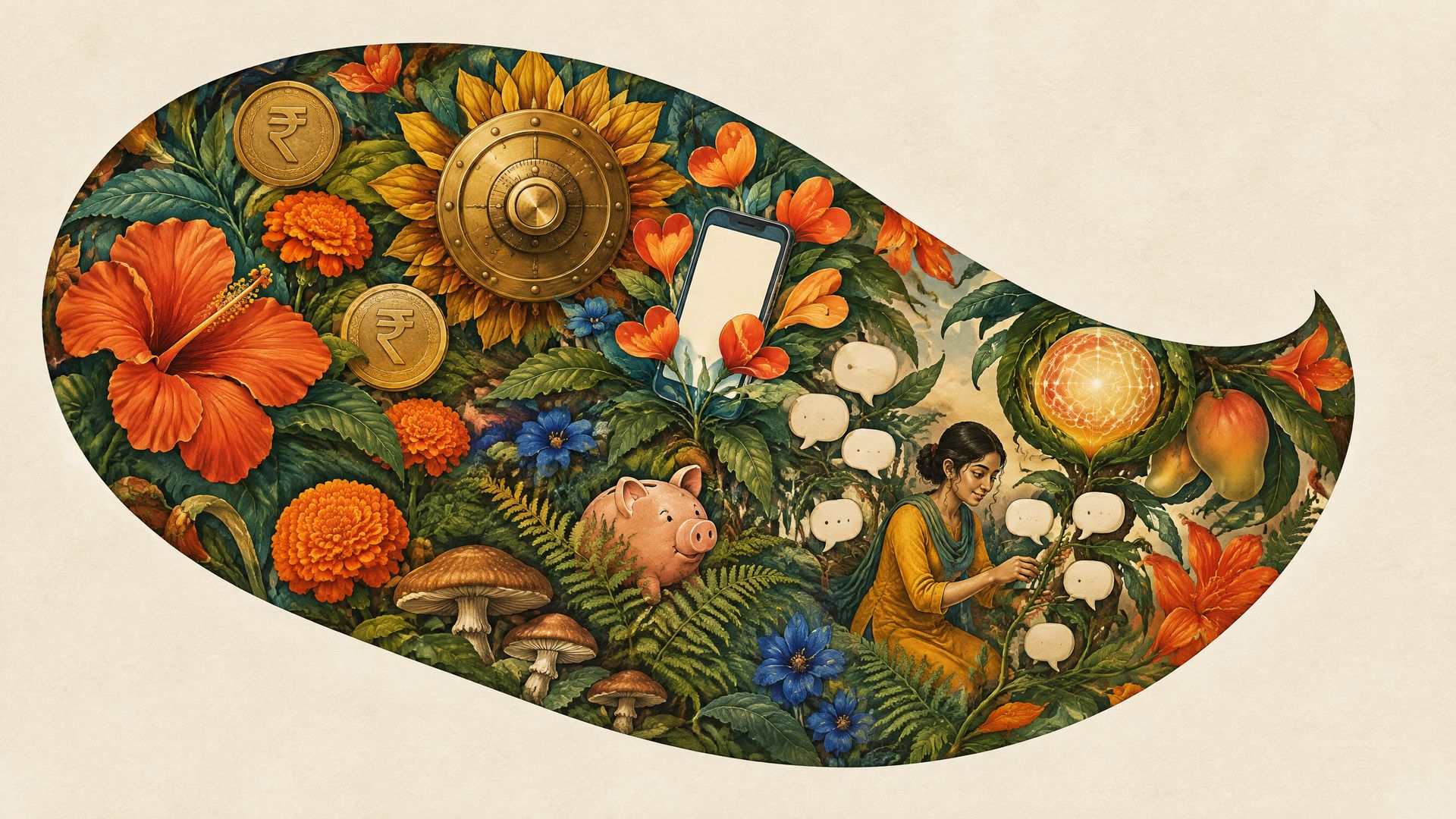
The board of a mid-sized private bank sits through a rebrand presentation in a Mumbai conference room. An hour in, the agency reveals a new symbol and a new colour. A director asks the question everyone is thinking: customers still queue at the branch, the app still logs them out, and the call centre still reads from a script. What exactly did we just buy? What is on the screen is a logo. The thing the board wanted was a brand.
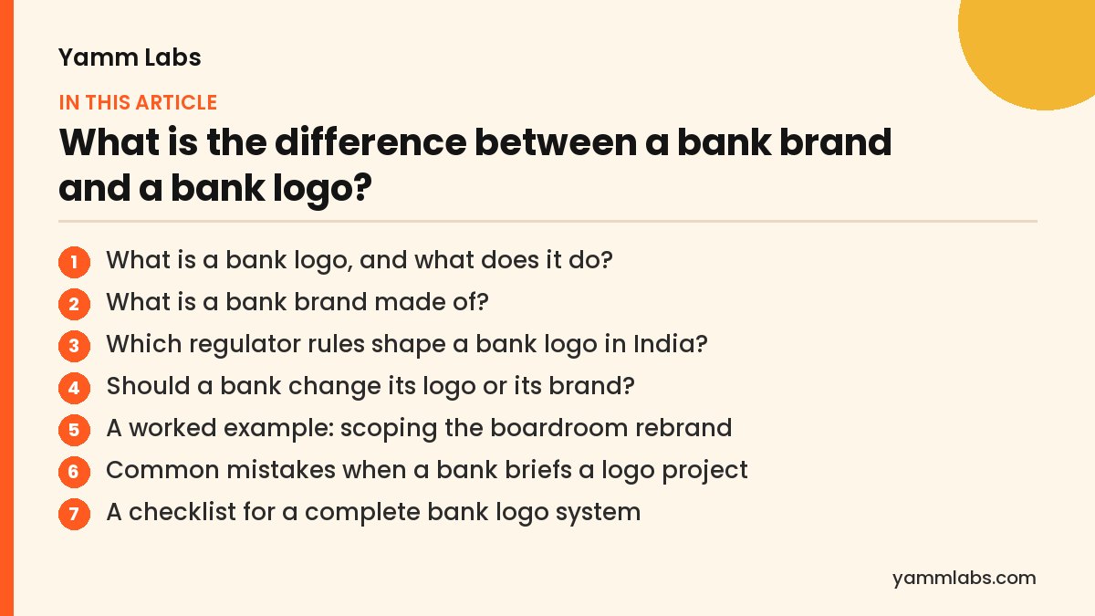
- What is a bank logo, and what does it do?
- What is a bank brand made of?
- Which regulator rules shape a bank logo in India?
- Should a bank change its logo or its brand?
- A worked example: scoping the boardroom rebrand
- Common mistakes when a bank briefs a logo project
- A checklist for a complete bank logo system
- How to brief an agency on a bank logo or a bank brand
- People also ask
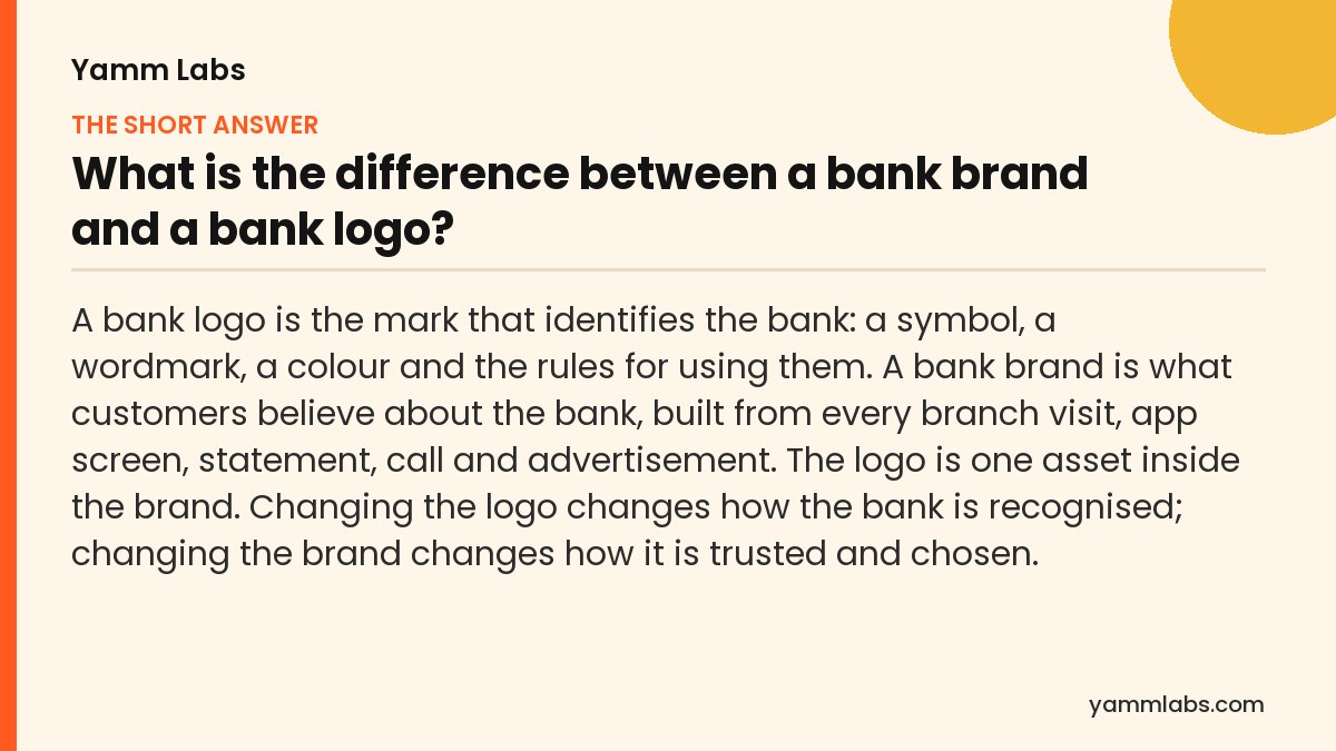
What is a bank logo, and what does it do?
A logo is an identifier. Its job is recognition: a customer should spot the bank on a card, an ATM fascia, a UPI screen or a passbook without reading anything. In practice a bank logo is a system rather than one drawing. It includes the symbol, the wordmark, the colour values, a minimum size, clear space around the mark, and versions for a card chip area, an app icon and a black-and-white cheque print.
A good logo is legible at small sizes, works in one colour, and survives being placed next to another company’s mark. For a bank that last point matters more than most, because the logo will sit beside partners on co-branded cards, lending apps and merchant terminals.
| Question | Bank logo | Bank brand |
|---|---|---|
| What is it? | A mark and its usage rules | The reputation and promise customers hold in their heads |
| Who owns it day to day? | Marketing and the brand guidelines | Every function: branches, product, service, collections, compliance |
| How is it changed? | A design project, then a rollout | Changes in products, service and communication over years |
| What goes wrong? | Poor legibility, misuse by partners | Customers do not trust it or cannot say why it is different |
| How is it measured? | Recognition and correct usage | Preference, trust, consideration and complaints |
A logo tells a customer which bank this is. A brand tells them why they should keep their salary there.
What is a bank brand made of?
A bank brand is the sum of what customers experience and what they are told. The logo is the smallest part of it. The larger parts are:
- The promise. One clear idea of what the bank stands for, such as speed, safety, reach or advice, that product and service teams can act on.
- Architecture. How the parent bank relates to its cards, loans, wealth arm and digital products: one masterbrand, endorsed sub-brands or separate names.
- Voice. How the bank writes an SMS alert, a loan rejection, a fraud warning and a festive campaign, in English and in regional languages.
- Experience. Branch queues, app flows, statements and grievance handling. A customer who waits on hold remembers that, not the colour of the hold screen.
- Proof. What the bank can show: reach, service standards, ratings and the way it behaves when something goes wrong.
If a bank runs several product lines, the architecture decision usually matters more than the logo. We cover that choice in our brand architecture playbook for banks with multiple products.
SIGNALNewsletter by Yamm Labs
The next piece, straight to your inbox.
New writing on BFSI brands, B2B and influencer marketing, and AI search.
One click to unsubscribe. Privacy policy

Which regulator rules shape a bank logo in India?
Bank identity in India is not a free design exercise. The rules below decide parts of the logo system before any designer draws a line.
- The name itself. The Banking Regulation Act restricts the words “bank”, “banker” and “banking” in a company’s name to banking companies, and requires a company doing banking business in India to use at least one of them. The design decision that follows: the wordmark cannot drop the word “bank” to look like a fintech, and a sub-brand for a product line needs care before it borrows the word.
- Co-branded cards. RBI’s credit and debit card directions require a co-branded card to state that it is issued under a co-branding arrangement, to bear the card-issuer’s branding prominently, and to show the issuer’s name clearly in all marketing material. The partner may not market the card as its own product. The design decision: the bank’s lockup needs a defined partner version with a fixed size ratio and position, agreed before the first co-brand deal, so the partner’s brand team cannot shrink it.
- Loan documents. RBI requires lenders to give a Key Facts Statement, including the annual percentage rate, before the loan contract is executed, for retail and MSME term loans sanctioned from 1 October 2024. The design decision: the brand’s typography and colour system must include a plain, high-legibility document style, because the most regulated page a borrower sees is not a place for decorative type.
None of these rules are about taste. They are why a bank logo system needs a compliance review in the brief, not at the end.
Should a bank change its logo or its brand?
Change the logo when the problem is recognition or function: the mark breaks at small sizes, fails on dark app screens, clashes with partners, or still carries the name of a merged entity. That is a design project with a clear end.
Work on the brand when the problem is belief: customers see the bank as slow, old or interchangeable, or new products are not being considered. A new logo alone will not fix that, and it can make it worse if the launch promises change that the branch and the app do not deliver.
Many banks need both, in order: settle the promise and architecture first, then design the logo system that carries them. For the shorter version of this and related questions, see our 100 bank branding questions answered.
A worked example: scoping the boardroom rebrand
Go back to the Mumbai conference room. The director’s question, what exactly did we just buy, is the right one, but it came an hour too late. The same board could have asked it at the brief, using the five differences in the table above.
What is it? The board wanted customers to see the bank as more modern and easier to deal with. That is a belief, so it is a bank brand problem. A new mark could signal the change, but it could not create it.
Who owns it? The queue at the branch belongs to operations. The app that logs customers out belongs to technology. The call centre script belongs to service. None of those teams was in the room for the reveal, which is why the new symbol felt disconnected from the complaints the director listed.
How is it changed? A logo is a project with a rollout date. The beliefs the board cared about change over years, through fixes customers can feel.
What goes wrong, and how is it measured? If the new bank logo launches before the app and the branch improve, customers see a fresh coat of paint on the same experience. The bank would track recognition for the logo, and trust, preference and complaints for the brand.
Scoped this way, the board would have commissioned two things in order: a brand programme covering promise, service fixes and voice, and a logo system designed to carry that promise once the first fixes were visible.
Common mistakes when a bank briefs a logo project
Most disappointing bank rebrands start with a brief that asks for one thing and expects another. The mistakes below come straight from the difference between a bank logo and a bank brand.
- Asking a logo to change beliefs. If customers find the bank slow, a new symbol will not make it faster. Fix or at least plan the experience first.
- Briefing only marketing. The brand lives in branches, the app, statements and collections. If those owners are not in the brief, the launch promises what they cannot deliver.
- Designing the mark before the architecture. A bank with cards, loans and a wealth arm needs to decide how they relate before a designer draws the family of marks.
- Forgetting the small sizes. A logo approved on a large screen in a boardroom may fail on a card chip area, a UPI screen or a black-and-white cheque print.
- Leaving compliance to the end. Name rules, co-branded card requirements and document legibility shape the system. A late review usually means redrawing parts of it.
- Measuring the wrong thing. Recognition tells you whether the logo works. It does not tell you whether customers trust or choose the bank.
A checklist for a complete bank logo system
Before a new bank logo is signed off, check that the system covers every place the mark will live. This list is built from the parts described earlier on this page.
- Symbol and wordmark, with the word “bank” kept where the name requires it.
- Exact colour values for print, screen and signage.
- A minimum size, tested on a card, an app icon and a UPI payment screen.
- Clear space rules around the mark.
- A one-colour version that survives a black-and-white cheque print.
- A version that works on dark app screens.
- A partner lockup with a fixed size ratio and position for co-branded cards and partner apps.
- A plain, high-legibility document style for loan documents and the Key Facts Statement.
- Usage examples showing what partners and branches must not do with the mark.
Where the checklist touches regulation, such as the name, co-branded cards and loan documents, confirm the current text with your compliance team before the guidelines are published.
How to brief an agency on a bank logo or a bank brand
Start the brief with the problem, not the deliverable. Write down which customer belief the bank wants to change, or state plainly that no belief needs to change and the work is a functional refresh. That single line tells the agency whether it is designing a logo or helping to build a bank brand.
Next, list the owners who must take part. For a logo refresh, marketing, legal and compliance are usually enough. For brand work, add the heads of branches, digital, service and collections, because the promise will be tested in their areas first.
Then attach the constraints. Share the architecture of the bank’s products and any partner agreements that use the mark, and flag the regulated surfaces: the name, co-branded cards and loan documents. Ask the agency to show the logo at its smallest sizes and on a partner lockup, not only on a hero slide.
Finally, agree how success will be measured. Recognition and correct usage for the logo. Preference, trust, consideration and complaints for the brand. A brief that names both measures keeps everyone honest about which job the project is doing.
People also ask
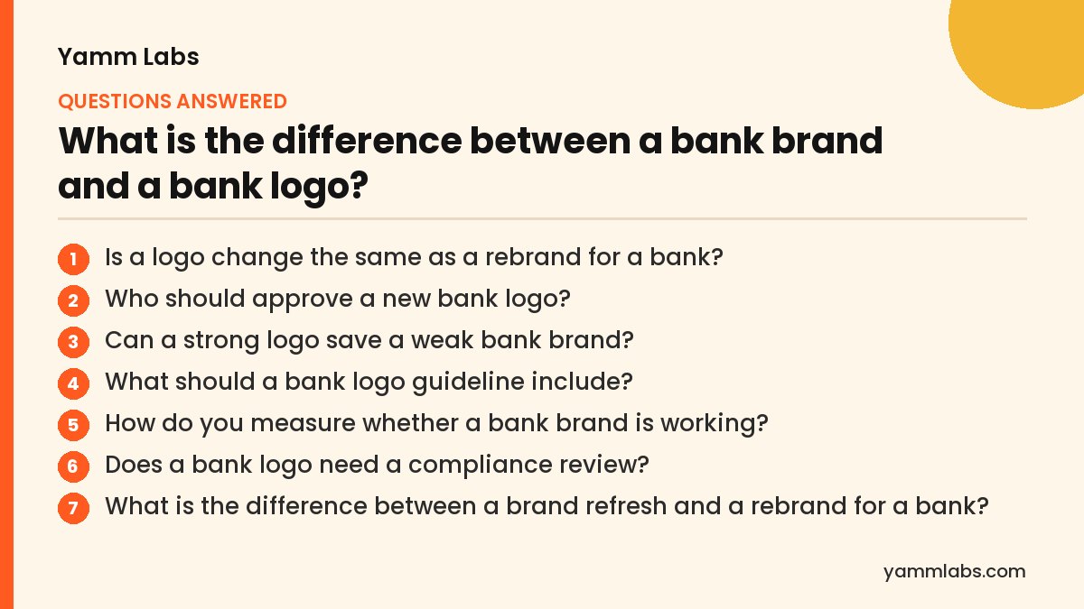
Is a logo change the same as a rebrand for a bank?
No. A logo change updates how the bank is recognised. A rebrand changes what the bank promises and how it behaves, and it usually includes a new or refreshed logo as one part of the work.
Who should approve a new bank logo?
Marketing leads it, but the board, legal and compliance should sign off. Legal checks trademark clearance, and compliance checks how the mark will sit on co-branded cards, partner apps and regulated documents.
Can a strong logo save a weak bank brand?
No. A logo can make a bank easier to recognise, but customers judge it on service, products and how problems are handled. A polished mark on top of a poor experience tends to draw attention to the gap.
What should a bank logo guideline include?
A bank logo guideline should cover the symbol and wordmark, exact colour values, minimum size, clear space, a one-colour version, a dark-screen version and a partner lockup for co-branded products. It should also show misuse examples. The aim is that a branch, a partner or a vendor can apply the mark correctly without calling the brand team.
How do you measure whether a bank brand is working?
Look at preference, trust, consideration and complaints over time, not only at recognition. Recognition tells you whether customers can spot the logo. The other measures tell you whether they believe the bank’s promise and choose it when they have an option. Complaint themes are often the quickest signal that experience and promise have drifted apart.
Does a bank logo need a compliance review?
Yes. In India, the bank’s name, co-branded card rules and the legibility of regulated documents all touch the logo system. A compliance review at the brief stage avoids redrawing lockups later. Confirm the current text of each rule with your compliance team, because directions are revised.
What is the difference between a brand refresh and a rebrand for a bank?
A refresh updates how the bank looks and is recognised, for example redrawing the mark so it works on small screens. A rebrand changes what the bank promises and how it behaves, and it usually includes a refresh as one part. If no customer belief needs to change, the work is a refresh and should be priced and timed as one.
Can a bank use a separate logo for a digital product?
It can, but decide the brand architecture first. A separate mark for a digital product works when the product needs its own identity, and it costs the bank some of the trust its masterbrand already carries. An endorsed mark, where the parent bank appears beside the product name, is a common middle path. Check the naming rules before a sub-brand borrows the word “bank”.
Why do some bank rebrands disappoint?
Usually because the new logo arrived before the experience changed. Customers see the fresh mark on the same slow app, the same queue and the same script, and the launch draws attention to the gap. Rebrands that land well tend to fix a few things customers can feel first, then use the new identity to signal that change.
Sources
Not sure whether your bank needs a new logo or a new brand?
Get a free Fintech Brand Audit across 8 dimensions, plus 3 fixes. No pitch. Run the free Brand Audit →
One Comment