

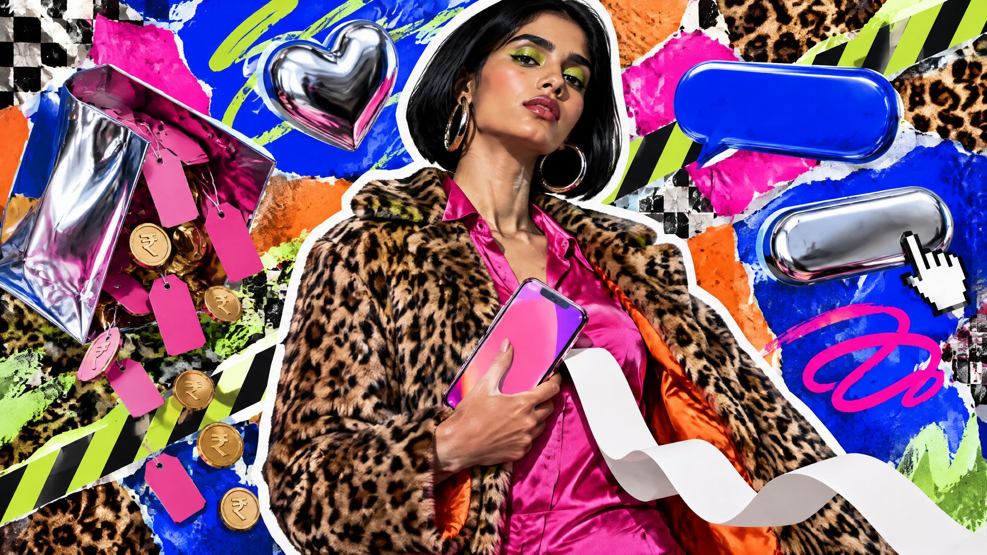
A product team in Gurugram is three weeks from launching a pay-later feature inside a shopping app. On the mood board: a screenshot of Klarna’s pink checkout button, a still of Snoop Dogg in a gold crown, and a sticky note that says “less bank, more brand”. Then the compliance lead walks in and asks where the Key Fact Statement goes. Nobody has drawn that screen yet. That gap is the whole story of Klarna’s pink: the brand that taught payments to look like fashion was built in the years before regulators decided what a pay-later screen must say, and the lessons only make sense if you read both halves.
- How did a payments company end up branded like a fashion label?
- What did “Smoooth” promise that a normal payments brand could not?
- Why did Klarna make its celebrities shareholders?
- Where did the fashion-label playbook stop working?
- Can an Indian payments or lending brand copy Klarna’s pink?
- What should a regulated brand in India take from Klarna’s pink?
- How to brief an agency on a Klarna-style brand
- People also ask
How did a payments company end up branded like a fashion label?
Before 2017, Klarna presented itself as a traditional payment provider, the service shoppers met at the end of a purchase. On 29 August 2017 the company announced the “Smoooth” brand: a new logo, a new graphic identity, redesigned checkout touchpoints and a new user experience. Its chief executive framed the aim as moving Klarna from a traditional payment provider to a stronger consumer brand, and called it “a new kind of bank”.
The colour was the loudest part. Design press later described the 2017 rebrand as the moment Klarna introduced its pink, and Brand New’s review of the identity, published on 21 September 2017, credits the work to DDB Stockholm. Klarna’s own announcement names no agency. The launch imagery was deliberately odd for a bank: ice cream melting on a warm car bonnet, a shampooed long-haired dog, a pencil pushed into a jelly pastry. None of it showed a card, a phone or a percentage.
That is how fashion labels behave. They sell a feeling and trust the product to be understood. Banks usually do the opposite, leading with the rate, the safety and the licence. Klarna chose the fashion order on purpose, and the timeline below shows how far it took that choice.
| When | What ran | Who made it, as sources report | What it changed |
|---|---|---|---|
| 29 August 2017 | “Smoooth” brand launch: new logo, identity, checkout touchpoints and app experience | Klarna’s announcement names no agency; Brand New credits DDB Stockholm | Pink replaces the look of a payment provider; the brand promise becomes one word |
| 17 January 2019 | “Get Smoooth” with Snoop Dogg as “Smoooth Dogg”, in Europe and North America | No agency named in Klarna’s release | The celebrity becomes a minor shareholder as well as a paid face |
| 11 to 12 February 2020 | Title sponsor of STYLE360 at New York Fashion Week, with see-and-shop presentations | Klarna and STYLE360 | Checkout moves inside the fashion show itself |
| Summer 2020 | “Swedish for smoother shopping” campaign in the United States | Production company Mirimar, director Andreas Nilsson, per MediaPost | The Smoooth idea is localised for a new market |
| 23 December 2020 | UK advertising regulator upholds complaints against four influencer Instagram posts | Advertising Standards Authority | Linking pay-later to lifting mood is ruled irresponsible |
| February 2021 | First Super Bowl spot, a 30-second film with Maya Rudolph playing four “quarter-sized” cowboys | Mirimar and Andreas Nilsson, per MediaPost | The product mechanic, pay in four, becomes the joke |
| 8 June to July 2021 | Global campaign with A$AP Rocky across social, online and out-of-home | No agency named in Klarna’s release | Style after lockdown; Rocky also joins as an investor |
| February 2024 | Brand refresh: redrawn wordmark, new typefaces, wider palette, pink kept | Klarna’s in-house team, type with Colophon, per Creative Review | The pink survives a full refresh as the one fixed asset |
| 11 February 2026 | FCA publishes final rules for Deferred Payment Credit | Financial Conduct Authority | Pre-agreement information and affordability become rules, not choices |
| 15 July 2026 | FCA regulation of buy now pay later begins | Financial Conduct Authority | Third-party BNPL lenders need authorisation or a temporary permission and must follow FCA rules |
What did “Smoooth” promise that a normal payments brand could not?
Klarna defined “Smoooth” as removing friction from the world of pay-later payments. The extra “o” does real work. It turns a feature, fewer steps at checkout, into a word a shopper can say, and it gives every ad a test: does this feel smooth or not?
SIGNALNewsletter by Yamm Labs
The next piece, straight to your inbox.
New writing on BFSI brands, B2B and influencer marketing, and AI search.
One click to unsubscribe. Privacy policy

Most payments brands promise three or four things at once: secure, fast, rewarding, trusted. A single-word promise forces the design system to choose. For Klarna it meant soft pink over hard blue, rounded type over engineered type, and art direction that looked closer to a fashion lookbook than a banking brochure. The same word also appeared in product copy and in partnerships, so the brand did not depend on one campaign to explain itself.
Owning a colour this way is rarer than it looks. In our experience financial logos cluster in blues and greens, and a brand that sits in that cluster must work harder on every other asset to be recognised. We cover the common mistakes behind that problem in our piece on fintech logo design mistakes. Klarna’s pink was protected by repetition: it survived the 2024 refresh, when the wordmark was redrawn, custom typefaces called Klarna Title and Klarna Text were developed with the foundry Colophon, and the palette widened to off-white, black, purples, grey and green around it.
Why did Klarna make its celebrities shareholders?
Celebrity endorsement is common in finance. What Klarna did differently was to put the celebrity on the cap table and inside the brand language. In January 2019 Snoop Dogg became a minor shareholder and was renamed “Smoooth Dogg” for the “Get Smoooth” campaign. In June 2021 A$AP Rocky joined as an investor and fronted a global campaign about rediscovering style as lockdowns ended, running through July on social, online and out-of-home.
The fashion logic is plain. Labels collaborate with musicians because the musician carries taste, and taste transfers. Klarna used the same move for a payment method. The Super Bowl debut in February 2021 went further and turned the product itself into the gag: four small Maya Rudolphs buying one pair of boots, because the offer was to pay in four.
- Ownership over rental. A shareholder story earns press coverage that a fee-paid endorsement does not, and it makes the partnership read as the star’s own belief in the brand.
- The brand word travels with the star. “Smoooth Dogg” carried the promise into every headline about the deal.
- The mechanic is the creative. The Super Bowl spot explained pay-in-four without a single line of terms, which is exactly what later became a problem.
Where did the fashion-label playbook stop working?
It stopped at the point where a feeling was being sold as the reason to borrow. On 23 December 2020 the UK’s Advertising Standards Authority upheld complaints against four Instagram posts by influencers paid by Klarna. The posts, made during the Covid-19 lockdown, linked buying beauty and clothing with pay-later to lifting or boosting mood. The regulator ruled that the ads irresponsibly encouraged the use of credit, told Klarna they must not appear again in their current form, and said future ads must not link the deferred payment service with lifting or boosting mood. The full ruling is on the ASA website.
This is the fault line in any fashion-style finance brand. A clothing label can promise that a jacket will make you feel better. A lender cannot promise that credit will. The same tone of voice that made Klarna feel light and friendly became a liability once it was attached to a mood rather than a product benefit.
The second limit arrived with regulation itself. The FCA defines Deferred Payment Credit as an interest-free form of credit repayable in 12 or fewer instalments over 12 months or less. From 15 July 2026, third-party lenders offering it must be authorised or hold a temporary permission, and consumers get affordability checks, key information before they agree, support when they miss payments, and access to the Financial Ombudsman Service. The FCA’s own buy now pay later page sets this out for consumers. None of this bans pink or celebrities. It does mean the terms can no longer be the part of the brand that stays off-screen.
Can an Indian payments or lending brand copy Klarna’s pink?
The colour, yes. The order of the screens, no. In India, digital lending by RBI-regulated banks and NBFCs falls under the RBI’s Digital Lending Directions, 2025, dated 8 May 2025, which set out how a digital loan must be presented. Four of its requirements change design decisions directly. The consolidated directions are published on the RBI website.
- The Key Fact Statement is a screen, not a PDF. The RBI requires lenders to give borrowers a Key Fact Statement that sets out the loan’s key terms, including what it costs. In a Klarna-style flow, the design decision is to give the APR and the instalment amount in rupees the same type size and contrast as the pink “confirm” button, and to place that screen before confirmation, not after it.
- Brand colour cannot pick the lender. Where a platform shows offers from several lenders, the RBI requires a display that enables a fair comparison, content that is unbiased and objective, and no dark or deceptive patterns. In practice we keep the brand accent off any single lender’s card on a comparison screen; pink marks the action, never the recommendation.
- The exit has to be visible. Borrowers must be given an explicit option to exit the loan during a cooling-off period by repaying principal and proportionate APR without penalty. That option needs a named place in the app, which means a line in the brand’s icon set and tone of voice for something most brands would prefer to hide.
- No silent limit increases. Automatic increases in credit limit are not allowed without the borrower’s explicit request on record. A celebratory “you’ve been upgraded” animation, the kind of delight moment Klarna built its tone around, has to become a request flow instead.
Each of these is a brand decision as much as a compliance one. Where the pink sits, what the type hierarchy puts first, and which moments get the playful voice are all choices that belong in the guidelines. Our guide to brand guidelines for fintech startups shows how to write these rules into the system before the first screen is designed.
What should a regulated brand in India take from Klarna’s pink?
Klarna’s story is useful because it shows both what a bold consumer brand can do in payments and exactly where it collides with credit rules. For a bank, NBFC, insurer or payments app in India, the lessons sort into what to borrow and what to leave.
- Borrow the single-word promise. “Smoooth” gave every asset a test. Pick one word your product can prove on every screen, including the disclosure screen.
- Borrow colour ownership, and protect it. Klarna kept its pink through a full refresh in 2024. Decide the one asset that never changes and let everything else evolve around it.
- Borrow the product-as-joke idea carefully. The pay-in-four gag worked because it explained the mechanic. In India, the RBI expects a loan’s cost to be disclosed to the borrower, not only its instalments.
- Leave the mood promise. The ASA ruling is the clearest lesson in the timeline: credit sold as a mood lift is where a fashion tone turns into a regulatory problem.
- Leave the idea that terms live off-screen. From the FCA’s 2026 regime in the UK to the RBI’s Key Fact Statement in India, the terms now have a defined place in the flow. Design that screen first.
If you are planning a payments or trading app brand and want the full list of questions to settle before you brief an agency, our 100 questions on trading and payment app branding covers colour, naming, onboarding and disclosure in one place.
Pink can sell a checkout; it cannot sell the loan behind it.
How to brief an agency on a Klarna-style brand
Go back to the Gurugram team with its mood board. The brief it sends an agency decides whether the pink ends up on the terms screen or only on the hero banner. A useful brief covers these points:
- The one word. The single promise the product can prove on every screen, the way Klarna used “Smoooth”.
- The fixed asset. The colour or mark that must survive every future refresh, and what it is allowed to signal.
- The regulated screens. The Key Fact Statement, any multi-lender comparison, the cooling-off exit and limit-change requests, listed as screens the agency must design, not appendices.
- The tone limits. Where the playful voice is welcome, and where it stops. Following the ASA ruling, a pay-later brand should never tie credit to mood.
- The review path. Who in compliance signs off each screen and each campaign, and how long that takes.
Ask the agency to show the Key Fact Statement screen in its first round, beside the checkout. If the brand only works when the terms are hidden, it is not ready. Rules are revised from time to time, so confirm the current RBI text with your compliance team before the flow is built.
People also ask
When did Klarna start using pink?
Klarna introduced its pink with the “Smoooth” rebrand announced on 29 August 2017, which brought a new logo, identity and checkout experience. The pink was kept through the in-house brand refresh reported in February 2024.
Who designed Klarna’s 2017 brand identity?
Klarna’s own announcement did not name an agency. Brand New’s review of the identity credits DDB Stockholm, and the 2024 refresh was led by Klarna’s in-house design team with typefaces developed with Colophon.
Why did the ASA rule against Klarna’s influencer ads?
In December 2020 the ASA found that four influencer Instagram posts linked using Klarna’s pay-later service with lifting or boosting mood during lockdown. It ruled that this irresponsibly encouraged the use of credit and barred that framing in future ads.
Can an Indian fintech use a playful brand for a credit product?
Yes, as long as the playful tone never replaces the terms. RBI rules require a Key Fact Statement, a fair and unbiased display where several lenders’ offers are shown, and an explicit option to exit during a cooling-off period, so the brand has to make those screens as clear as the fun ones.
What does Klarna’s “Smoooth” mean?
Klarna defined “Smoooth” as removing friction from the world of pay-later payments. The extra “o” turned a product feature, fewer steps at checkout, into a single word a shopper could say. It also gave the brand a test for every asset: does this feel smooth? That single-word discipline is the part of the 2017 rebrand most worth borrowing.
Did FCA regulation end Klarna’s fashion-style branding?
No. The FCA’s rules, in force from 15 July 2026, do not ban pink, celebrities or playful art direction. They require authorisation or a temporary permission for third-party lenders, affordability checks and key information before a consumer agrees. The effect is on the order of the screens: the terms now have a set place, and the brand has to design around it.
Is your pay-later flow as clear as it is on-brand?
Get a free Fintech Brand Audit across 8 dimensions, plus 3 fixes. No pitch. Run the free Brand Audit →
One Comment